
Applying the principles to design for the web
The web — and digital media in general — is rapidly becoming the preferred media for accessible information. Not only does digital technology have a huge potential for adaptability, it is generally quite easy to access this potential. But it should be noted that digital media is not more accessible than any other media type out of the box. Like anything else, digital media like websites need to be designed from the start with accessibility in mind. In this section we will briefly go over some of the most important applications of accessible web design.

Alternate Text
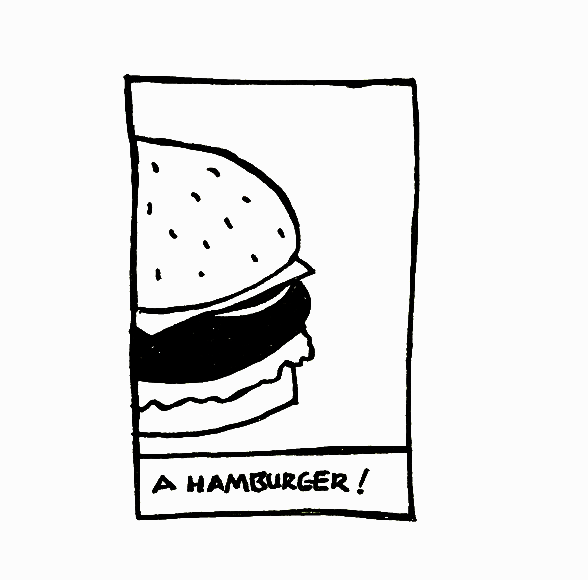
Alternate text is text that can be converted by assistive technologies into the format that your user needs, ranging from braille interpreters to text-to-speech. In HTML5 you can write alternate text using the alt=”” value. Think of alternate text like a caption on a photograph or a plaque beneath a work of art. It should describe the image in a way that is short and straight to the point. The most effective alternate text is generally 1 to 2 sentences in length.
Furthermore, if there is text in the image that provides important information or context, you need to include it in the alternate text as well.
Typography
Typography is what language looks like
, so needless to say it is important to the accessibility of a website. Many of the principles of good typesetting in print design are also applicable to type on the web. The subject of typesetting is a very intricate and detailed subject, for further information I recommend picking up a copy of Robert Bringhurst's Elements of Typographic Style. For the purposes of this guide, these are the most important principles of web typography to keep in mind:
- Try not to use text in your images, instead use real text typeset in HTML5
- Use simple readable fonts for your body text
- Try to limit your fonts to a maximum of three
- Avoid using smaller type sizes, try to use a minimum size of 1em
- Use relative units for font-size; not pixels
- Also don't justify the text on your website. Ever.


Semantic Markup
In HTML5 we have the ability to add semantic elements into each web page. This allows us to code our websites so that it’s content can be determined programmatically by assistive technologies like screen readers. Avoid using the <div> and <span> tags where there are semantic alternatives. Try instead to use semantic tags like <main> <article> <section> <header> <nav> <footer> etc.
There are some circumstances where formatting content without any semantic meaning is okay. If the markup that you are formatting doesn’t affect how the perceivability of the content, then it is generally okay to use non-semantic markup. An example of a scenario where non-semantic markup is alright is if you are setting up a grid system for your website, it would be fine here to use a <div> and <span> tag styled with CSS.
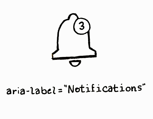
Visual Equivalency
Information or instruction for understanding or operating content can never be communicated through visual presentation alone. Any information, structure, or relationship conveyed through the visual presentation must be able to be programmatically determined, or is otherwise communicated in the text.
When visual spatial indicators such as shape, size, location, or orientation are used to communicate information, there must also be non-visual equivalents provided. This supplemental representation will increase accessibility and clarity for all users.
Consider using the aria-label property from the ARIA features. It is a part of HTML5, and it can be used to define dynamic content and user interface controls for users with disabilities.

Color Contrast
Colour contrast is especially important for text but applies to any important graphical element on your website. According to WCAG specifications, your normal text should have a contrast ratio of at least 4.5:1 while your larger sized text — like headings — need a minimum contrast ratio of 3:1.
Furthermore, overly saturated colours should be avoided in general use web designs as it places a strain on your users’ eyes. The colour contrast ratio of your text can be quickly checked using the Stark plugin for Adobe XD, Figma, and Sketch.
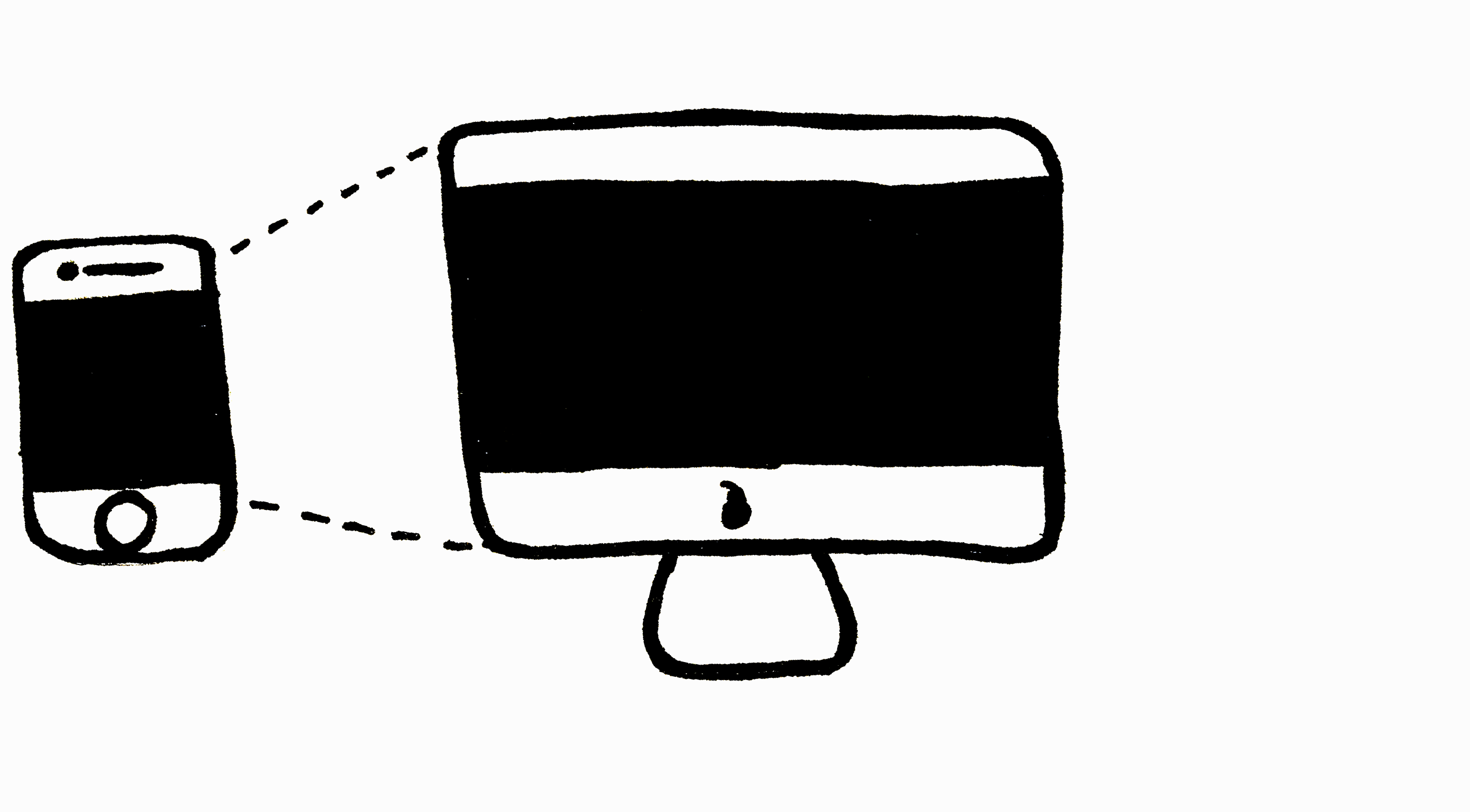
Viewport
The viewport is the frame in your web browser that shows users the content of your website. You should design your website so that it's visual presentation is fluid and has the ability to shift between different orientations, screen sizes, and zoom levels without disrupting the website's content. This can be achieved easily using CSS using @media screen queries.
Animations
First of all, please don't have anything flashing on your page more than three times per second. This is important as a measure to prevent seizures in your users. If you are making an animation heavy website that has a lot of blinking, moving, or page scrolling, be sure to provide your users with a way to pause the animations. Further, any image slideshows or carousels should have a method to pause as well as manually control them. Preloader animations don't need controls as they only play when functionality is unavailible on your website.